THE LOVE INTEREST Behind the Scenes: An Interview with the Designer
May 16, 2017 | 3:00 PM
THE LOVE INTEREST Behind the Scenes: An Interview with the Designer
By Team Fierce Reads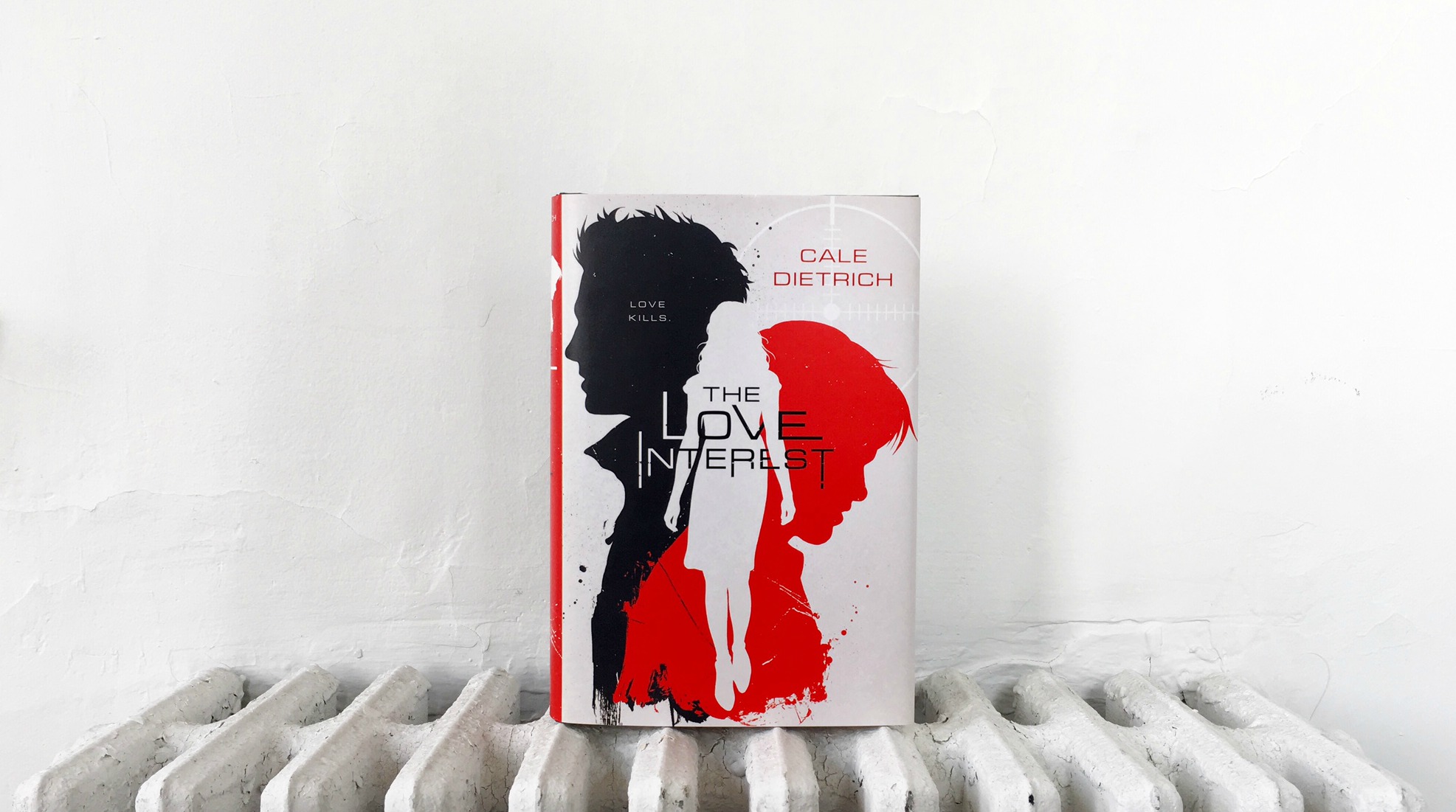
The following is a Q&A between Cale Dietrich, author of The Love Interest and April Ward, the cover designer for The Love Interest. Are you ready to find out what went into the cover design for The Love Interest? Keep reading!
Cale asks April:
Hi April! I’m so, so thrilled to be interviewing you. I’m totally in love with the cover you made for The Love Interest, and I’m so excited to hear some behind the scenes info about the process of creating it.
1) What was your first idea for the cover? Did you start thinking up concepts from the pitch letter, or did you read some of the book?
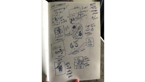
I love to read the manuscripts before I start in on cover design and in the case of The Love Interest it was such an absolute page-turner that I couldn’t stop! I had to know what happened between Dylan and Caden! I read manuscripts on my phone during my commute, and as I’m reading I’ll write little notes to myself on character, settings, and possible graphic imagery. Next, I’ll jot down a list of concepts and do thumbnail sketches so I can start thinking about compositions and color combinations.
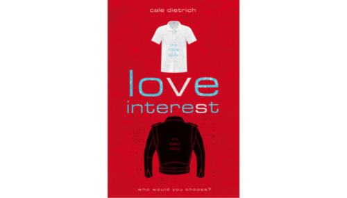
For The Love Interest, there was so much good material to work with! The overlapping heads with the girl walking through was one of the first thumbnails I came up with, but I also started with some good guy vs. bad boy iconography, like horns vs. halo and polo shirt vs. leather jacket. I also knew I wanted to play around with the idea of the guys strapped down to an operating table sort of like Nip Tuck or Botched. Oh, and the red laser that separated Caden and Dylan the first time they met also seemed like a great visual to try. I also kept thinking about the competition aspect of the story, and how to show it in a more graphic way. The best I could come up with for that direction was an arm wrestle concept, but it didn’t really pan out visually.
Once the thumbnail drawings are done and I know I have a good amount of directions to explore I start putting them together digitally and playing with color and type. From there some concepts tend to stand out and others fall to the side depending on what kind of imagery I find for the early designs.
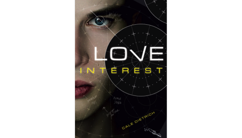
2) Were there any elements in The Love Interest that you knew you wanted to represent on the cover? And how does one chose what parts to represent on a cover?
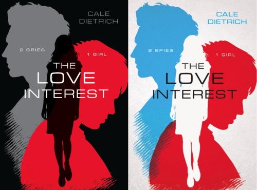
Actually, the hardest part in the case of The Love Interest was narrowing it down! I really wanted to get across the good guy vs. bad boy element because we all know that both are incredibly appealing in their own way. In terms of choosing which parts to represent I really like to show a good amount of variation in the early stage so I can feel confident that we’re exploring enough and choosing the best one. From the larger bunch of early cover designs (8 or 9?) it was narrowed down to four covers that were approved by the editor and creative director to show to sales. I brought those four to an art meeting and I was so happy that the sales group opted for the graphic cover! That was my favorite direction because I think it lets the reader really imagine the characters in a way that feels more personal.
3) I’ve had a lot of people tell me the cover looks like a badass spy movie poster, which I think is the most awesome thing ever. Were you inspired by those? Or if not, can you share any visual inspirations you had for the cover?
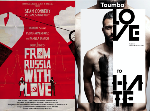
YES! I love the James Bond type poster design with that classic yet deadly appeal, I definitely used that style as inspiration for the look of The Love Interest. Once I start mocking up cover ideas I do some visual inspiration searching, usually on Pinterest. Early on I wasn’t sure if the cover would be graphic or photographic so I was gathering a bunch of varied visuals. One was a poster of From Russia With Love, and another showed a totally different direction with this shirtless guy just staring at the viewer with his body cut in half by type that said “Love to Hate.” I loved that and was very inspired by the direct pull of that eye contact. Though in the end, the cover had no eyes, it did inspire the idea of the bullseye used around your name!
4) I think the color combo of red, white and black is incredibly striking. How early on did you decide on this color scheme? Did you ever try out alternate colors once you’d locked in the final idea?
Originally I really wanted to do something with red, blue, and cream! I love red and blue together, it makes me think of those 3D glasses and a mix of hot and cold that’s really appealing to me. When the concept went to our art meeting the worry from sales was that the color palette was reading retro. I tried a good amount of variation on that, and the red and black idea came from my boss, Rich Deas. I was hesitant about it actually because I feel like he owns red and black but he was right!
5) Do you have any favorites from the covers that didn’t end up getting picked? What about the design made it a favorite?
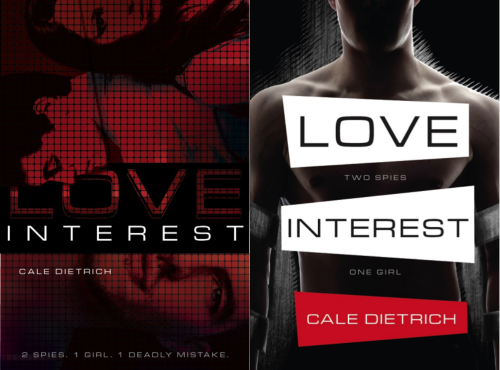
My favorite besides the winning cover was the first one from the very early comps, the one with the polo shirt and leather jacket that didn’t make it to the art meeting. I loved that it sort of seemed like they were facing each other and that the “V” and the “S” stood out subtly in white from the blue letters. It’s easy to get attached to early ideas. But it’s also a good reminder for me that sometimes you have to move on and just trust the process.
April asks Cale:
Hi Cale! So excited to interview you as well!
1) What was your first reaction when you saw the cover of The Love Interest? Who was the first person you showed this cover when you got the chance?
I FREAKED OUT! I’d been on what felt like cover-alert for months, where I was constantly checking my inbox for any word about the cover. Because of the time difference, I usually get all of my publishing related emails when I wake up. So one morning I remember waking up and immediately checking my inbox, like always. It was empty, so I just went about my day. I’d been awake for maybe half an hour, so I was still kinda sleepy when I saw that the tab in my browser had a (1), and I just knew that was it. And it was!
Honestly, I loved it from the first second I saw it. I didn’t have like a crystal clear image of the cover I was expecting (other than I thought it’d be blue, for some reason) but as soon as I saw it I knew it was the most perfect cover. It was so cool and striking and badass and yeah, perfect is the word that comes to mind. The first person I showed was my housemate, who freaked out about it as much as I did. And then I emailed it to family/friends and I had them open it while I was on the phone with them so I could hear their live reactions. It was a super fun day.
2) What has been your favorite fan reaction to the cover art of The Love Interest?
Ohhh good question! Someone once called The Love Interest cover the most badass cover in the YA game, which I thought was pretty freaking cool! A lot of people have taken some amazing Instagram photos of it, and it always looks so great. I also get a massive kick out of people saying it looks like a super stylish spy movie poster.
3) Aside from the final cover, do you have any favorites among the other covers that were not chosen? (Don’t worry, no covers were incinerated or otherwise harmed throughout the selection process). What do you like about some of the alternate covers?
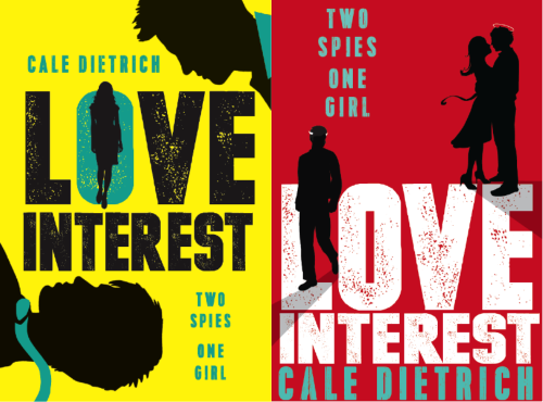
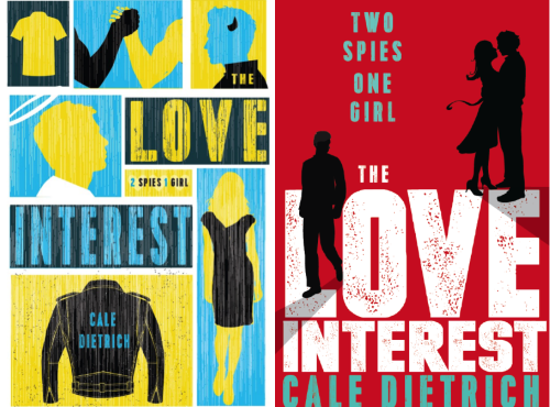
Haha I’m glad no covers were harmed! And I actually really love them all! I’m such a sucker for covers and I think they’re all really amazing in their own ways. I love how bold and colorful the red ‘two spies, one girl’ cover and the yellow and blue one are. They both feel really punk-y to me and I love them for that.
If I had to pick a favorite, though, it’d be the one that shows Caden and the alterations the LIC is going to make to turn him into a Nice. I think it’s super stylish and it reflects The Love Interest so freaking well. It’s hard to explain, but I feel like there’s something special about that one. But I feel so lucky with all of them—like, I’d read all of those books. And for the record, my absolute favorite is the one you picked, so yay!
4) Just out of curiosity, if you had to pick, which do you think you are—a Nice or a Bad?
Oh, I’m a Nice for sure! I’d be the WORST Bad, I can’t brood at all.
The Love Interest by Cale Dietrich is in stores now. Get your copy today!